Final Press Pack
- Ellie Bradbury-mcCann
- May 18, 2022
- 3 min read
Updated: Jun 15, 2022
What did you do?
I made a press kit slideshow of the trailer with all the information about the ghosted genre and the synopsis of it including the film facts, about the cast,about the crew,the publicity of the film,merchandising and the trailer so people have an idea of what it is actually about.
What did you choose to put in to your Media Kit? based upon your research
I put the main bit about the trailer and the video on it I also described the cast and crew and said the main parts of the film facts including all the merchandise and what website to get it from. I also made a social media page for example instagram and made it look like a well known trailer so it looks good and stands out so people would want to watch it more.
How did you link up the video (YouTube hosting on a link pdf) exported as a video
I went on to youtube and went on the camera icon saved the video in my files and then uploaded it and named the trailer underneath.
How did you choose the photos to illustrate each section?
I chose some photos on google and went on a background website with a couple of ideas I liked then i picked it and edited it out on photoshop and added the fonts i liked which looked grungy and made it stand out by picking the colour red and then added the date and the netflix logo on my poster also i used a couple of my own pictures so one looked realsitic and one didn't at the same time.
Merchandising/promotional material for the Media kit
What you are going to do and why?
• I am going to place my merchandise on line. I have made a collection of merchandise for It
would sell on a site like RED BUBBLE https://www.redbubble.com/shop/netflix+fans that attract Netflix fans

The difference between these two is that the other shop has multiple merch and it is different it even has stickers of all thre netflix programmes and films that are on t-shirts hoodies phone cases but with mine it is very dark and you can tell it looks very grungy but vintage at the same time especially with the tote bag and the t- shirt it stands out because of the bold red grunge font that is on everything.

• The Audience for my merc is aimed at Teens/Young Adults. I found this research from TEENVOGUE https://www.teenvogue.com/story/psychologists-say-fandoms-are-amazing-for-your-mental-health
• I am going to use the main image from my Netflix Poster I did this because it looks good and it stands out so people know what it is straight away with the big bold font especially when it is red and the grunge style of it pops out with the type of genre. This links with the reserach from Teen Vogue. “Fandoms,” as they’ve grown to be called, are a group of people who all admire or support a particular entity in popular culture, usually in the case of television shows, book series, movies, artists or performers."
My targeted audience are part of this Fandom. It is important that the image and font is recognisable to the film. I will choose a dark colour fabric with pale grey or white slightly faded Font. This product will link with the film poster by using the same central image from my film. I will also create other merc to complement it using the same image.
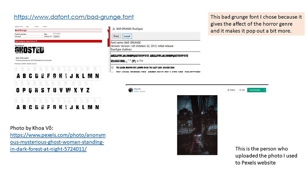
My image was from Photo by Khoa Võ: https://www.pexels.com/photo/anonymous-mysterious-ghost-woman-standing-in-dark-forest-at-night-5724011/
The image was then edited out on photoshop and then i added the fonts which i got on https://www.dafont.com/bad-grunge.font
I used https://smartmockups.com/ to create my mockups.

I created a range of merc to for my fans. I chose to make a range of items that young adults might buy for example a coffee mug, tshirt and hoodie, a bag and a phone case. these are all popular items.
Why we looked at existing texts?
Because the font had to fit in with the genre and I chose the grunge font because I felt like it stood out especially in red and I think it is very important to make sure you find the right fonts for posters and for example clothing brands pretty much everything that is worthy to be put out there so it has to catch the publics attention and it is very useful to make sure you pick something that suits what subject it is and whether it is a genre the colour has to be good as well so it can fit in with backgrounds.


Comments