Production of my Netflix film poster and the final poster
- Ellie Bradbury-mcCann
- May 9, 2022
- 1 min read
Updated: Jun 14, 2022
Preproduction:
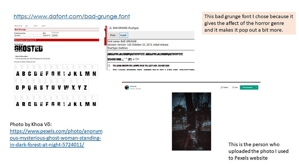
First I went on to dafont and looked at all the grungy type of styles for the text to be good enough for my poster and I also picked out the colour which was red because it stands out so much more than the other colours and it represents danger,blood and anger which shows that it is along the lines of horror and it makes it very bold so it fits in with the horror genre. I then found a background for the title ghosted and I edited that then put it on photoshop I also made it a bit blurry and messed around with it so it looked right and the netflix logo had a line between it near the date so I had to make that look like the same red line so it was so much better and it then looked like the real thing and I used layers because it then looks normal and it isn't then all over the place and I only wanted to affects the background not the title so it all looked appealing on the final bit of the poster.


My final Film Poster using the Smoke Overlay at approx. 40% opacity.

Final Production process Image. What I did on my final poster.

Websites used:
https://www.pexels.com/photo/anonymous-mysterious-ghost-woman-standing-in-dark-forest-at-night-5724011/ (image for poster)
https://www.heyuguys.com/netflix-2022-slate/ (font for netflix)


Comments